Hello. My name is Damien Mallon and I am a Graphic Designer & Illustrator based in Belfast. Check out some of my work below and please do get in touch. The site I previously used for my portfolio shut down, so please bear with me while I reupload my old work.
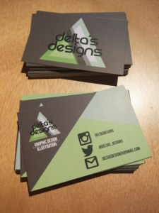
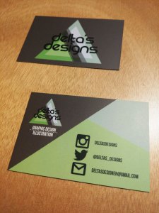
Business Cards
These are my most recent business cards, which I had printed after I re-branded myself last year. I am really happy with how they came out. I had a lot of fun working on the new logo, name and colour scheme and I think the final design reflects the time and effort that went into the project.
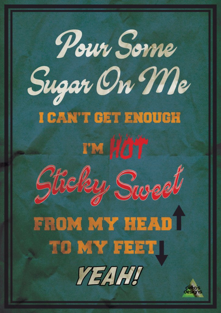
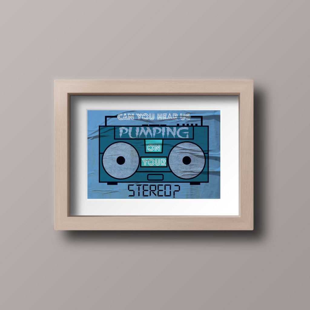
Illustrated Lyrics
This was a fun personal project, where I took some of the lyrics from some of my favourite songs and decided to visualise them in creative and graphic ways. I then photoshopped some of them to see what they would look like in a frame and on an actual wall.
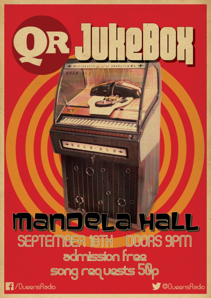
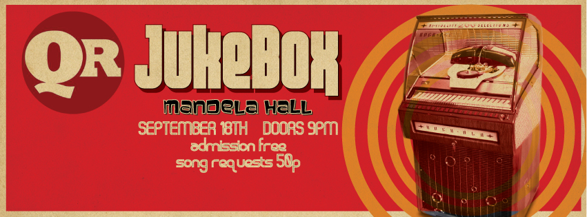
Queens Radio Jukebox Promo
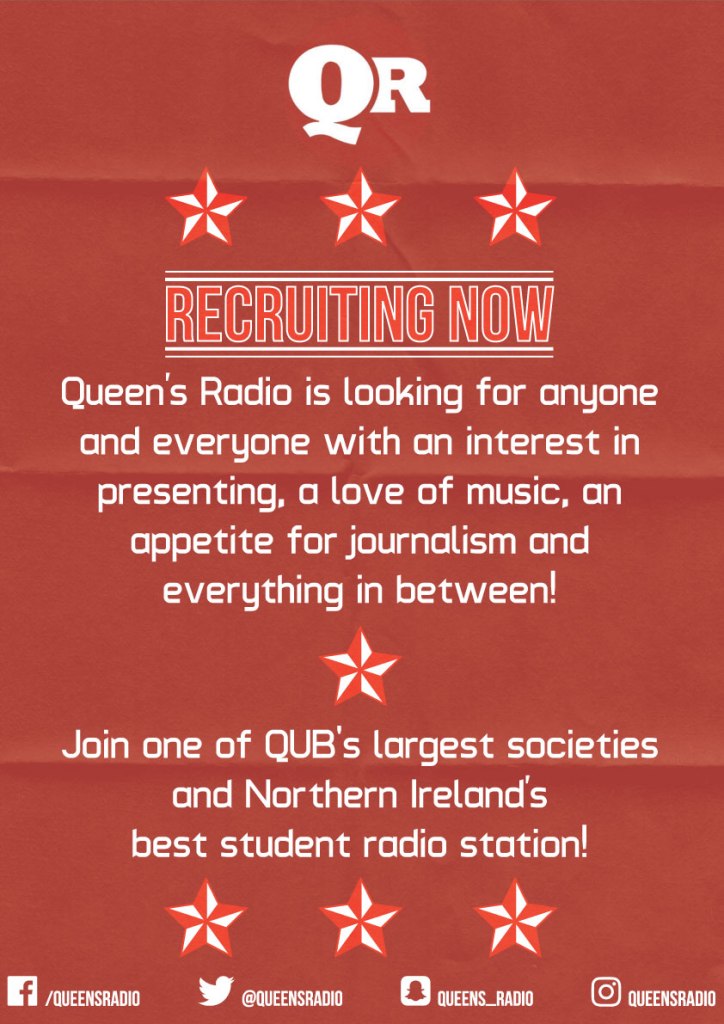
This was a project that I undertook a few years ago for the Queen’s University Radio Society. I was tasked with designing the branding, as well as the promotional materials for their Jukebox themed night. The clients wanted it to look retro and also like a recruitment poster from WWII. I researched the relevant themes and reference materials and worked closely with the group to finalise a satisfactory design. I was also tasked with designing a poster for the Fresher’s Day, which was intended to invite new students to join Queen’s Radio.
I really had a lot of fun on this project. It involved working with a group of clients and gave me some invaluable experience. Plus, I was tasked with designing for print, as well as screen, as I was to design a facebook banner and a flyer. On the night of the event, my designs were used physically at the event, as well as being projected in the Mandela Hall.
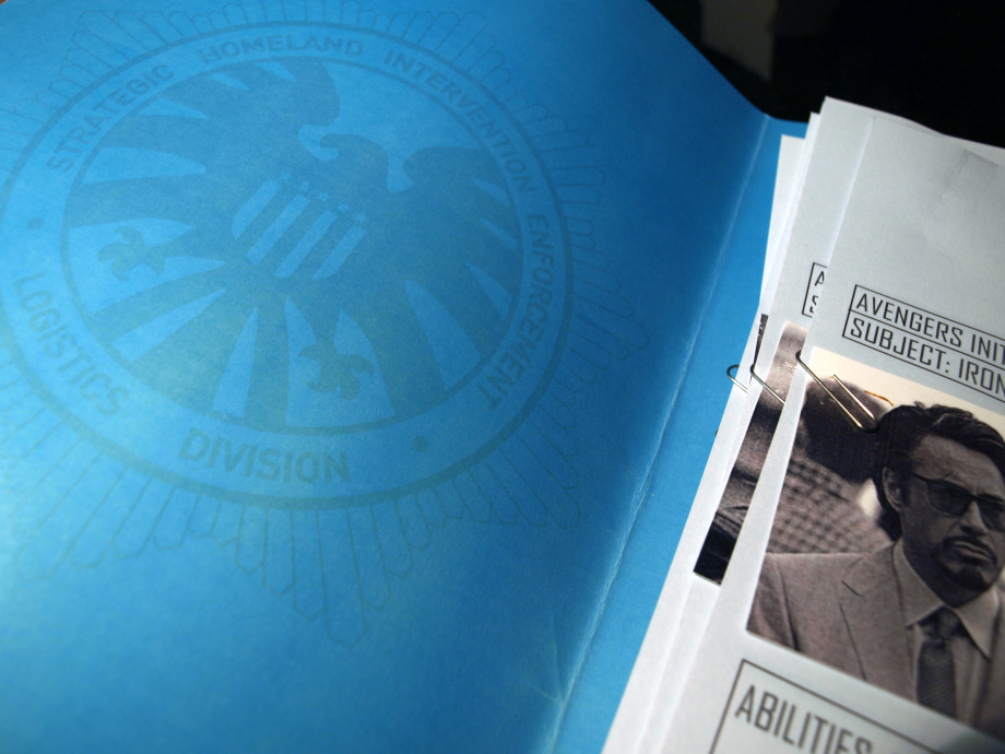
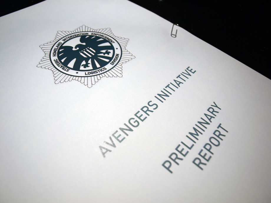
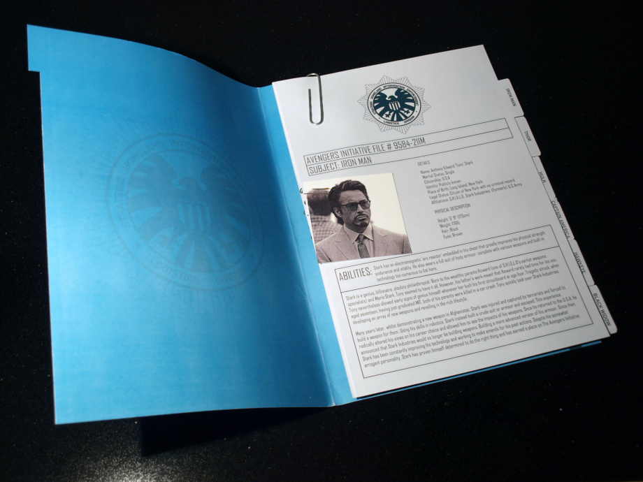
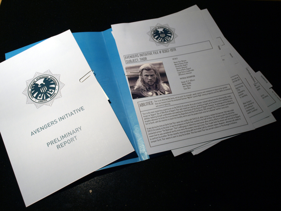
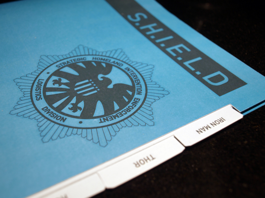
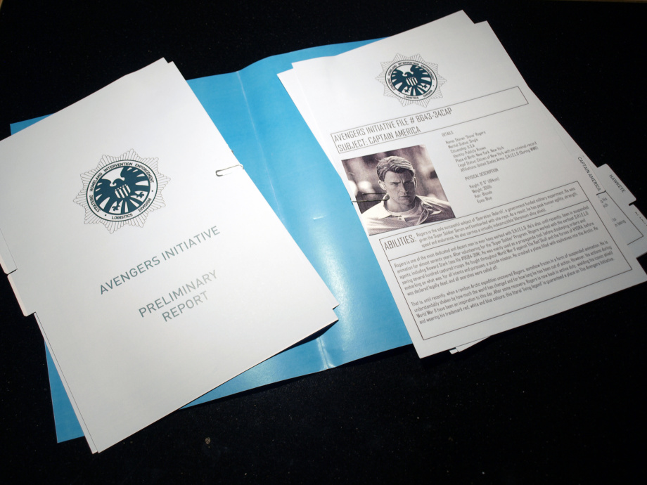
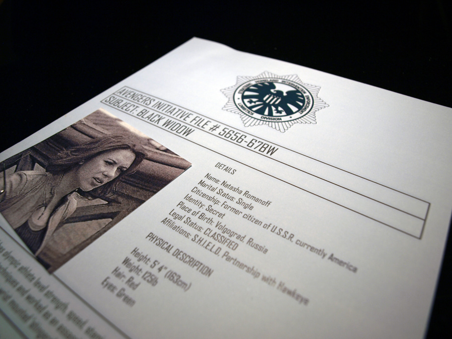
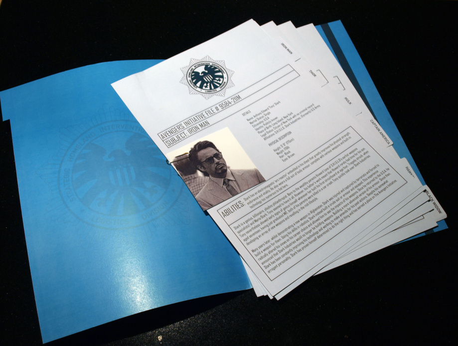
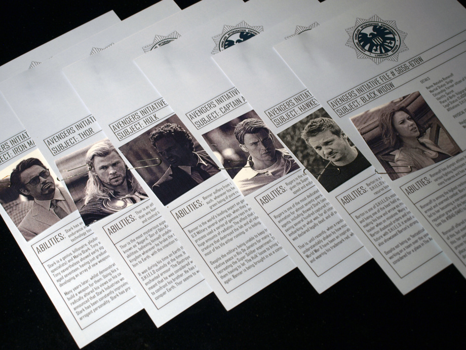
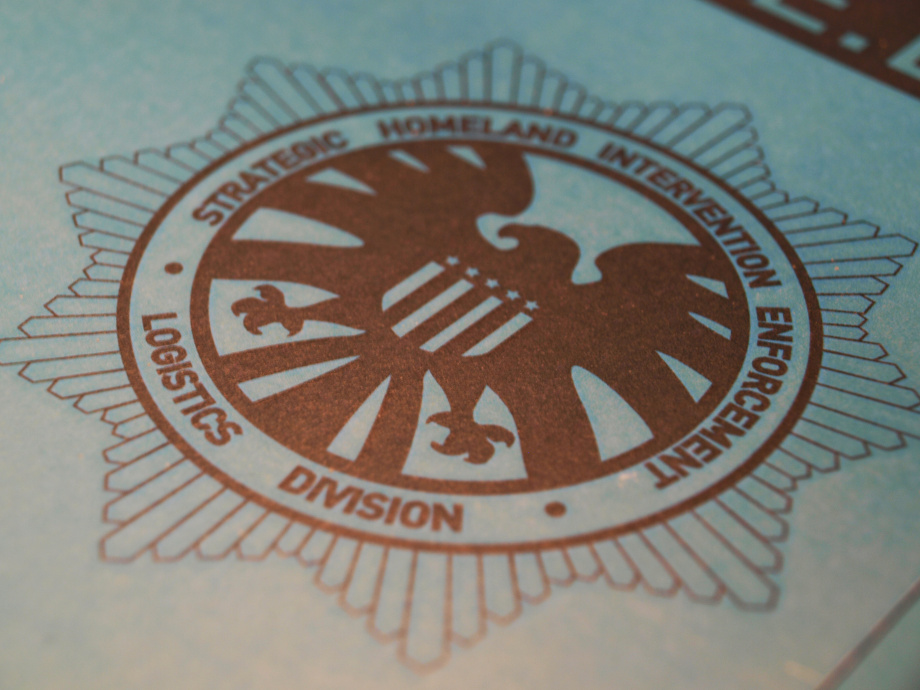
Avengers Publication
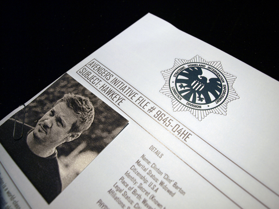
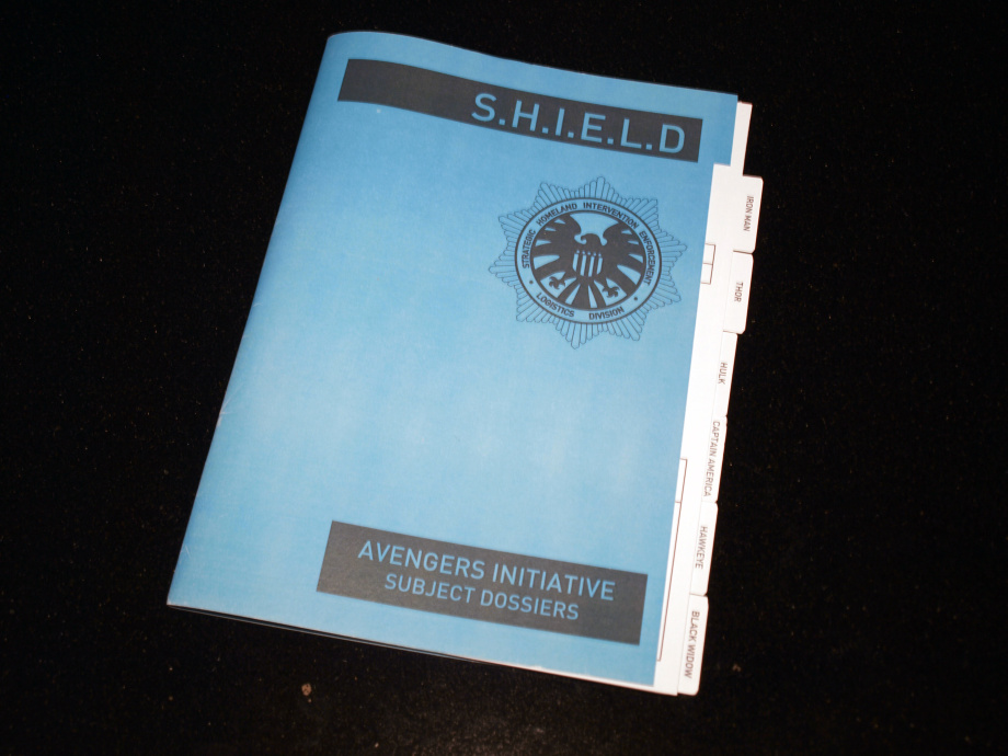
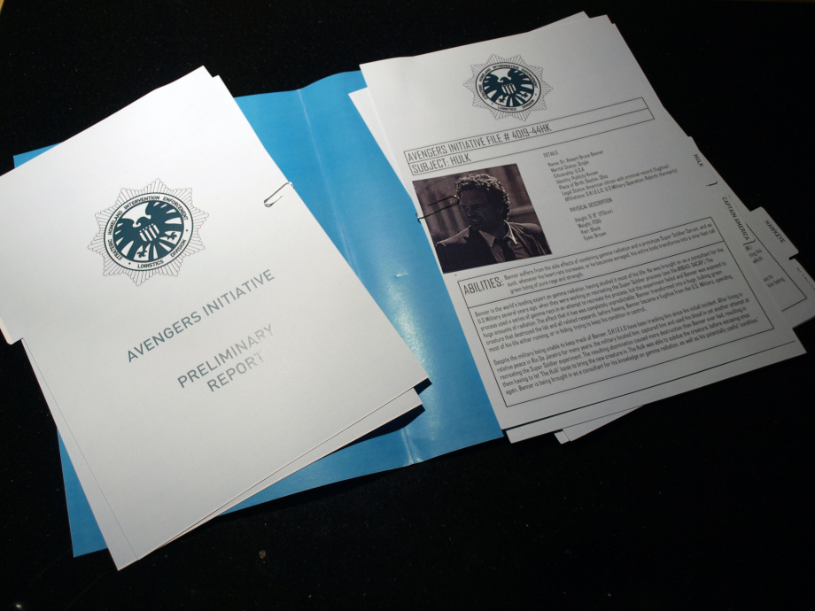
This was part of my University final project and shows my ability in publication design. This was a part of my final submission in final year at university. I wanted to create a document based on the Avengers film from Marvel. I wanted the document to be designed to look like a secret agency’s file, observing the six main characters, providing notes on each of their strengths, weaknesses and how suitable they are for recruitment by S.H.I.E.L.D. Each page was printed and cut, with each document’s label sticking out in a cascading pattern like a filing system. Attached to each document with a paper-clip was a small, candid photograph of each character, adding to the authentic feel. Overall, I am happy with how the project turned out, as it helped me to work with image, text, different paper types and different styles of publication. It also helped me creatively, by writing each piece ‘in character’ as someone observing each character and making notes on them.
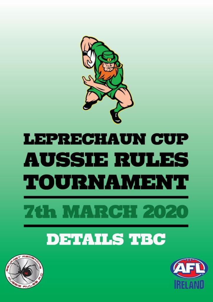
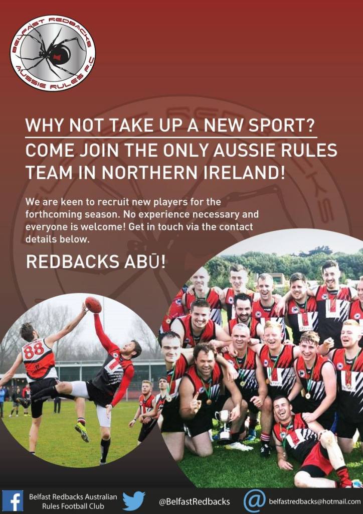
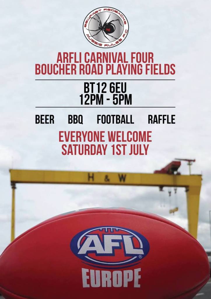
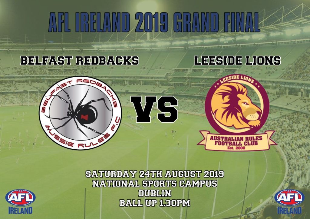
ARFLI Posters
This is a sample of some of the promotional work that I have done over the years for my brother. He plays the aussie rules sport and often asks me to help with the online promotional materials, This involves back and forth between his team, other team representatives and myself, to help finalise all designs. These are used on social media to attract new players, advertise upcoming tournaments, or to provide any changes of venue, etc. I enjoy working with these projects, as it involves working with typography, second hand imagery and PNG files of logos. Every one has been a learning experience and has been done in a different style, which helps them stand out on their own.
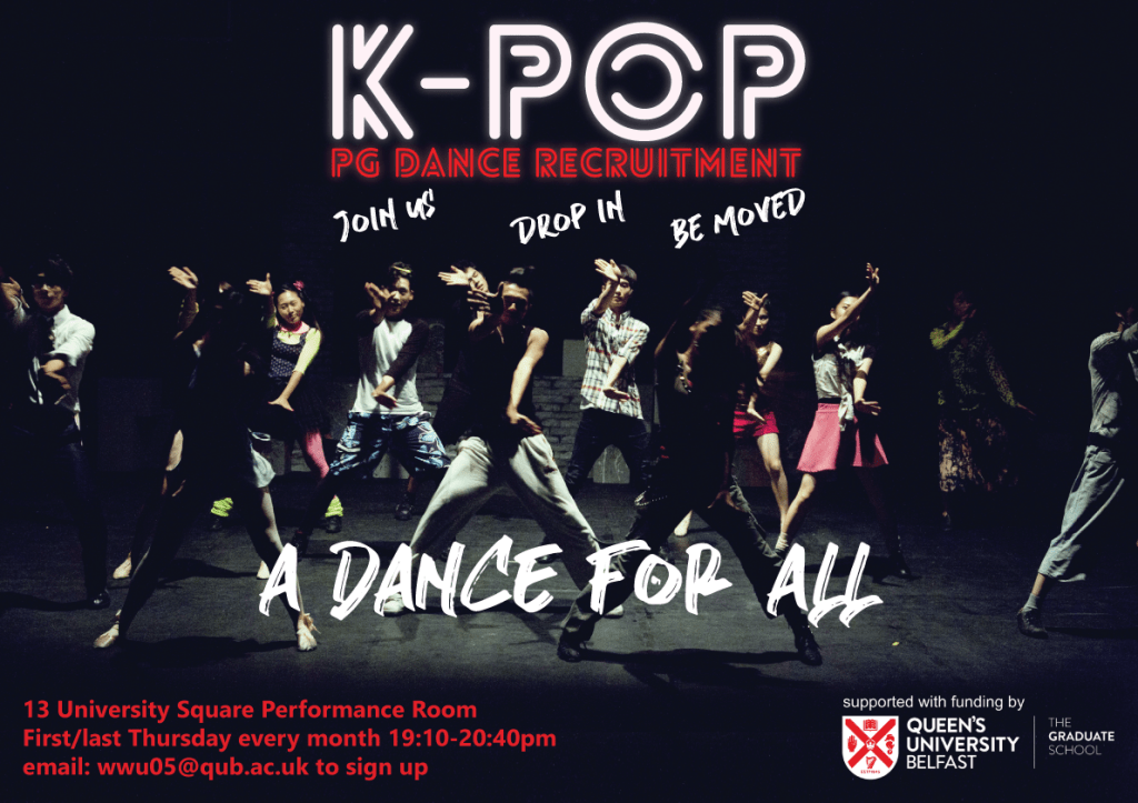
Dance Class Poster
This was made for a client who needed help promoting her class to new members. I was tasked with using striking imagery and text to help make it sound appealing to new people. Because it was a K-Pop class, I opted to use thematically appropriate fonts and go for big, bold, modern typography. This allowed the information n to be communicated instantly and effectively.
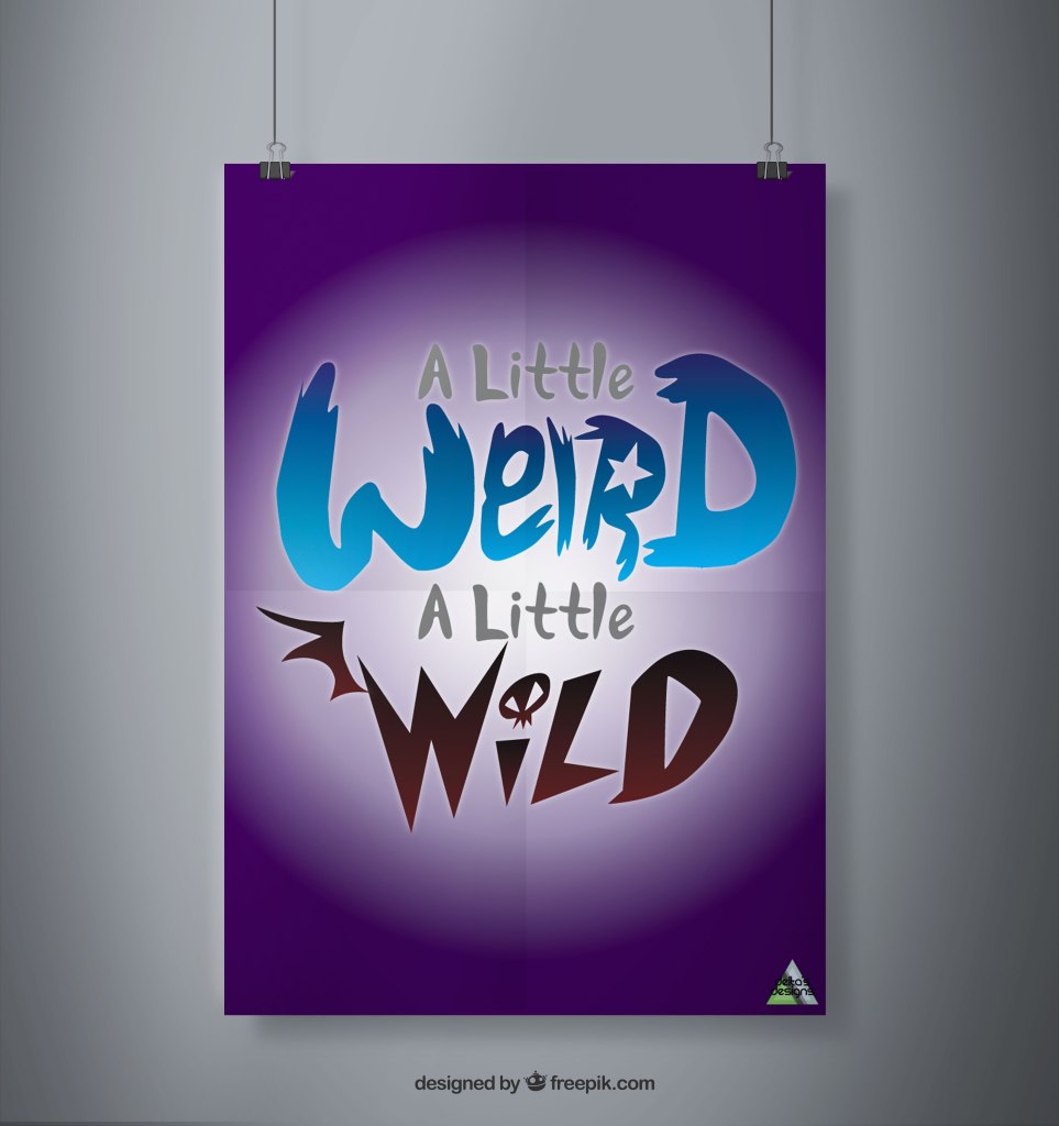
Strong Typography
These were for a personal project. The first is based on a Disney show and the second is based on an anime. For each, I used fonts and typography that emulated the show ‘s logo and used colours that fit their tones. It was a fun project and helped me practice using textures and PSD files that made for decent poster mockups.
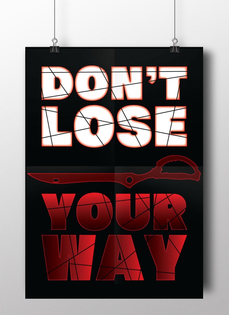
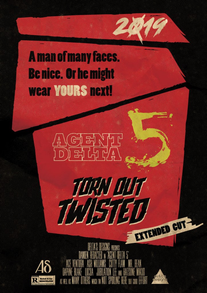
Grindhouse Design Poster
This was another recent personal project and I had a lot of fun experimenting with layout, fonts and textures. I wanted to emulate an aged, grindhouse style poster and to make it look like a movie poster. I added credits and a rating at the bottom, as well as using multiple layers to help add to the OTT style of the genre and make it look like an old, beat up print. I also chose to limit myself to a basic colour palette of red, black and white, wit the yellow number 5 being the focus, this allowed it to draw in the eye much better. This ended up being one of my proudest projects, as it taught me a lot and has expanded my CS abilities and techniques.